Case Study: SaaS-ifying a Legacy Desktop App that got H5 acquired

/
Lead UX Designer
Results
Addressed 15 Years of Design Debt: By transforming neglected legacy desktop app into a modern browser-based SaaS product
Wider Audience Reach: By hosting DART on the Relativity platform
Shiny Acquisition Target: Redesign helped H5 get acquired by Lighthouse
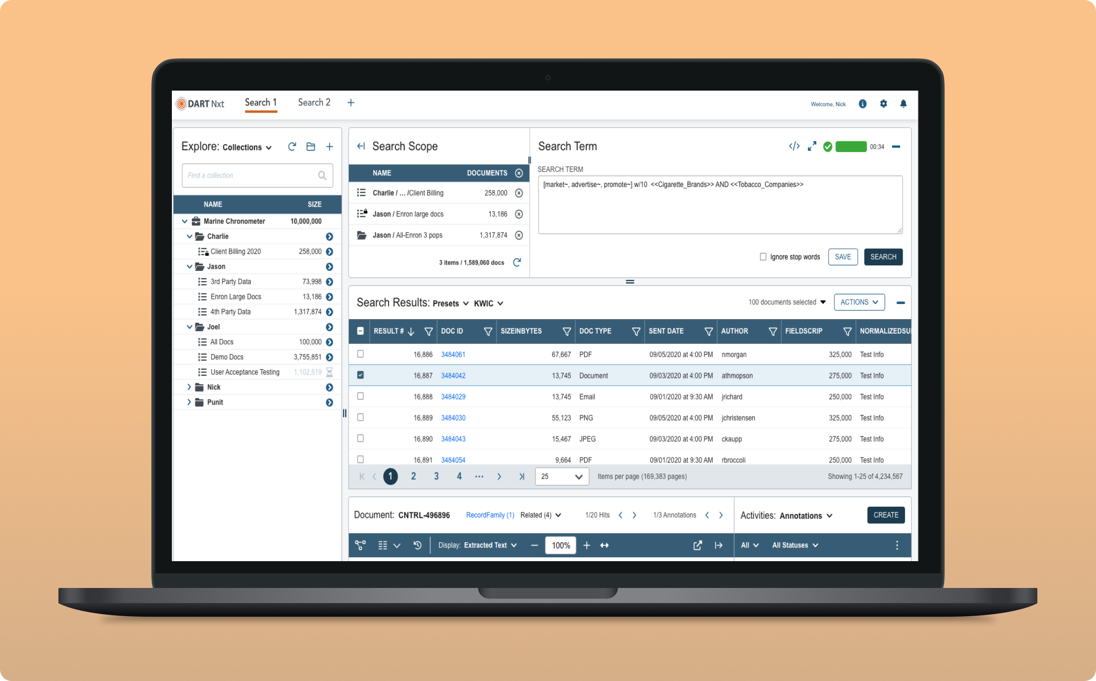
I transformed this

into this!
The Client: H5 / Lighthouse
H5 eDiscovery was a pioneer of e-discovery, technology-assisted review, and e-discovery services. They provided highly accurate document review via their technology-assisted review service.
Lighthouse Global acquired H5 eDiscovery in September 2021.
Lighthouse Global is the leading provider of e-discovery, technology-assisted review, and case preparation support. They help corporate counsel and their legal teams find the documents they need in the context of litigation, investigations and compliance, while ensuring that costs are contained, deadlines are met, and risk is minimized.
Methodologies
User Experience strategy
Design system creation
UX and UI documentation
Information architecture
Site mapping
User journey mapping
Wireframes
Wire flows
Remote user research
Customer feedback
Concept validation
User acceptance testing
Solution sketching
High-fidelity mockups
Icon creation
Print design
Agile development
HTML and CSS definitions
Software
Adobe Photoshop
Adobe Illustrator
Adobe XD
Balsamiq
Atlassian Jira
Atlassian Confluence
The Project
Transform VPN-based legacy desktop app into a web-based SaaS app
Created in 2006, DART was a desktop application for internal Search Strategists and Reviewers to analyze and review documents.
DART was only accessible through VPN on a virtual machine.
Features include:
Creating collections of documents from a larger population
Creating complex search queries
Running those search queries onto the created document collections
Reviewing search results, and marking them for further actions before delivery
DART accrued a significant amount of design debt due to no UX presence at H5 for the 15 years prior to my arrival. Since it was an internal tool, revenue was not directly tied to DART sales, hence no reason to upgrade or address design debt. Until now.
My Role: Lead UX Designer
Timeline: November, 2020 to December 2022, 2023
Focus: All stages of design
I concurrently supported design for DART and Matter Analytics while managing mid-level designer who supported both teams
Products:
Matter Analytics
Document Analysis Review Tool (DART)
The Users and Their Environment
User 1: H5 Internal users
Setting: Desktop-based application accessed through VPN and virtual machine
User 2: H5 and Lighthouse customers
Setting: Browser-based SaaS products hosted on the Relativity platform
Why Redesign DART?
Wider Audience: DART needs to be browser-based so it can be hosted on the Relativity platform
Design Debt: 16 years of development without UX research or design involvement has created usability issues
More Data: DART needed new features to leverage data ingested from Matter Analytics
Desired Outcomes
Maintain review velocity
Simplified collection creation
Intuitive advanced query creation
Standardize interactions across workflows
Project Timeline

My Contributions
My Contributions by Phases
Phase 1: Discover Issues and Define Challenges
Learn features and vast capabilities of DART from Product Managers, with a focus on only part of the overall DART tool
Conduct comprehensive user research to understand current behaviors, workarounds, pain points, and product utopia scenarios
Phase 2: Develop Answers and Deliver Solutions
Redesign VPN and desktop-based application to browser-based SaaS product
Reconcile 15 years of feature development done without any UX presence or contribution
Reconcile entire tool including interface, interactions, workflows, use cases, visual language, design system
Redesign interactions with consideration to browser performance issues
Redesign user interface to fit in context of Relativity platform wrapper (think Salesforce for legal-technology)
Audit interactions, interface elements, color usage, workflows, and product architecture
Create and continuously iterate on new visual language, design system, and UI kit
Conduct user research using clickable prototypes to ensure workflows and interactions meet user expectations
Iterate on designs at key points during the research series using the Rapid Iterative Testing Environment (R.I.T.E.) approach
Curveball 1: DART Product Manager of 15 years leaves H5
Right in the middle of intense problem solving and design iterations, our PM is moving on from H5.
The show must go on. They were very gracious to give 2 months notice, providing plenty of time for knowledge transfer and workshopping. This allowed DART’s progress to continue in their absence with little disruption.
Curveball 2: Lighthouse acquires H5
Congratulations! But, So. Many. Questions. What’s the fate of DART? What’s the fate of the H5 product suite? What’s my fate at H5?
Thankfully, Lighthouse had a great team and culture, and I would be gaining a handful of seasoned and supportive colleagues in a UX team as a result of the acquisition.
Phase 3: Align to and expand Lighthouse design system
Align DART to LH design system, including layouts, UI Kit, color palette, visual language, workflows, and interactions
Collaborate closely with LH Design System designer to audit and review interface elements from both LH and H5 products
Expand LH design system to account for features, interactions, workflows, and UI elements from DART and H5 products
Curveball 2: Revise H5 Matter Analytics to ingest Lighthouse data sets for DART
Lighthouse needed to benefit from the algorithms in Matter Analytics, and ultimately the document review capabilities in DART.
Phase 4: Revise Matter Analytics to prepare LH data sets for DART
Revise Matter Analytics designs, interactions, and workflows to ingest and run H5 analytics algorithms on LH data sets
Matter Analytics analytics algorithms and data sets are then fed into DART for further analysis and human intervention
My Methods
My Methods
Discover Issues
I identified pain points and opportunities by conducting customer and stakeholder interviews
Define Challenges
I translated findings from customer interviews into tangible challenges to be addressed
Develop Answers
Collaboratively gathered input across departments
I mapped user journeys, user task analysis, and interaction diagrams which informed our understanding of users
Deliver Solutions
I delivered consistent, standardized workflows and interfaces for the complex needs of DART’s users
I created and iterated on task flows, wireframes, interfaces, high-fidelity screens, and clickable prototypes for desktop and mobile screens
Discover Issues
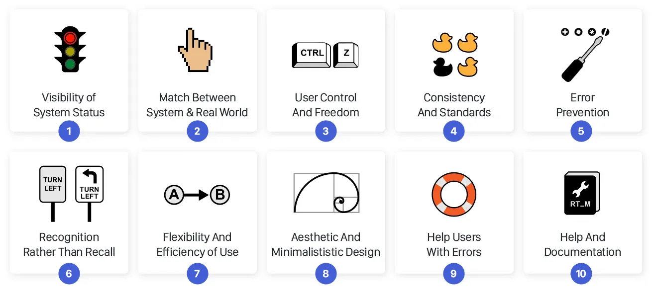
Image: Abbas, Nayyer (2023, May 15) 10 Usability Heuristics for User Interface Design
First, as with all my projects, I conducted a usability assessment. I used Jakob Nielsen’s 10 Usability Heuristics for User Interface Design as a guide. I usually uncover a few trending usability issues, and dig deeper on those initial findings. It would be too time-consuming to go through all 10 of them.
What I found
The interface lacked consistency across various tasks (4: Consistency and Standards)
No error prevention (5: Error Prevention)
Didn’t help users with errors (9: Help Users Recognize, Diagnose, and Recover from Errors)
No documentation (10: Help and Documentation)
Additionally, the interface looked like Windows 3.1, but it was 2020.


Then, I conducted discovery user research to identify delights, pain points, workarounds, and challenges.
Delights:
Double monitors
Ultra-compact display
Pain Points:
Having to VPN into a virtual machine
Losing monitor screen real estate because of VPN
Workarounds:
Collapsing panels
Challenges:
Reviewing documents using only one monitor
Persona
After conducting my initial discovery research, I created a persona based on the aggregated findings.

Define Challenges
Challenges:
Browser-based performance
Screen real estate
Risk in only redesigning part of the application
Business Goals:
New look and feel
Consistent workflows
Consistent interactions
Constraints
Building into Relativity’s 3rd party platform
Relativity’s upcoming platform UI redesign
Build new MA engine to leverage Relativity data
Engineering split between Matter Analytics + DART
Redesign User Interface for MA + DART
Prioritization
Now (MVP)
New information architecture
Simplify Collection creation
Audit / document “components”
Create new design system
Next
Less frequently used features
Non-critical admin screens
Advanced search queries
MVP Admin screens
Later
Revise MA for LH data
Advanced features
Align to Lighthouse DS
Develop Answers
My basic formula for developing answers is as follows: Get Inspired, Explore Possibilities, Iterate, and Test. Rinse and repeat.
Get Inspired:
Research apps
Explore Possibilities:
Exhaust explorations
Design design system (UI Kit) for DART
Iterate:
Iterate those designs
Test:
Concept validation
Iterate and test again:
Iterate into high-fidelity mockups and clickable prototypes and test again
Rinse and repeat until clean
Get Inspired
I researched products with similar complexity, a more modern design, and related industry. I was inspired by Salesforce and Relativity.

Salesforce
Bento boxes separate content, providing context
Clean modern look and feel
Padding between elements allows data to breathe
Information hierarchy is clear, creating visual cues

Relativity
Also uses bento box design
Provides example of screen real estate
Will blend with container interface
Color scheme is similar to H5/Lighthouse
Explore Possibilities
When I explore possibilities, I first focus on layout, work flows, and product architecture. This allowed me to quickly explore without the visual design getting in the way. Separately, I’m working on a design system that accounts for all the things I’m learning during initial exploration phase.

Early explorations
Focused on workflows over visuals
Allows for speedy explorations without visual design slowing down the process
Refining user tasks for efficiency
Iterate
Once the general concepts have been tested, I iterate on those designs. I incorporate early design system components, refining them as I get a clearer picture of how they will and won’t work with the work flows.

Iterations
Incorporates early components of new design system
Sets up design for high-fidelity mockups
Enables clickable prototype testing
Begins to finalize the design system
Test
As I always say “Test early, test often".” User research isn’t a one and done exercise. I am constantly conducting research with users on my designs. Using sketches, low-fidelity wire frames, and clickable prototypes, I’m able to quickly and easily understand how and more importantly, IF users will be able to complete their tasks using my design proposals.
Another thing I always say is “Design is just a theory until user research is conducted.“
My favorite way to conduct user research is to use the RITE methodology. The acronym RITE stands for Rapid Iterative Testing Environment, and enables designs to be tested, iterated, and tested again within a single research series. This methods provides for the fastest feedback and iteration loop possible, and is a great way to build rapport with your users.
The example below is when I tested the interface for a formula builder. I went through 2 separate series of RITE sessions, and have included some findings and results below each image.
Session A

Issues Uncovered
Users had difficulty creating groups
Buttons had similar names, adding to the confusion
Formula move icon was mistaken for a menu icon
Red icons made users think there were errors
Iterations
Removed buttons from formula contents
Consolidated buttons to reduce information overload
Made remaining buttons more prominent
Used a different icon for the move icon
Removed color from the interface, except for CTAs
Results
80% of users could
Locate the group creation action
Successfully move a formula row
Session B

Issues Uncovered
Some users still had difficulty creating groups
Some micro tasks were unclear
Users misunderstood ability to edit selections
Target areas for some actions were too small
Iterations
Displayed uneditable fields using disabled state
De-emphasized buttons
Aligned them to the Lighthouse Design System
Relocated buttons to be more contextual
Increased click/tap target of smaller icons
Results
100% of users
Located group creation button
Successfully moved formula rows on their own
Clearly understood how micro tasks work
Understood how and when to edit selections
Test-imonials
The feedback we got from users was a nice validation of our efforts. Here’s a few memorable quotes from our participants.
This is way better than what we’ve been using for the last 10 years!
Creating advanced queries is so much easier this way.
This design seems easier. I was always confused by inclusion and exclusion.
Finally! This application is desperately in need of an update!
Deliver Solutions
There’s still so much to do, let’s finish strong!
I still needed to
Finalize UI kit
Document the design system
Create mockups
Produce clickable prototypes
Conduct user acceptance testing
UI Kit for Design System:
Finalize UI kit
Document Design System
High-Fidelity Mockups:
Designs in JIRA
Pair with engineers
QA and troubleshoot designs
Create walkthrough videos for engineering to more clearly understand the interactions and workflows
Clickable Prototypes:
Create clickable prototypes
User Acceptance Testing:
Partner with users, and engineers, and QA
DART PM of 15 Years Leaves H5
But wait!
15 years of DART product management, user relationships, and institutional knowledge is lost.
Offboarding:
Gave 2 months notice
Trained their replacement
Workshopping
Research program:
PM-led research sessions
Rapport, game changer
User research program continues smoothly
Lighthouse Acquires H5
What happens next?
While redesigning DART certainly helped make H5 an acquisition target, the future of DART was now unclear.
Concerns:
How do H5’s products fit?
What is Lighthouse’s design system?
What are Lighthouse interaction patterns like?
Align to Lighthouse Design System and Products
Align to a New Design System
Thankfully the new design team at lighthouse were awesome! I just gained a new UX tribe!
There were a few challenges though. It wasn’t as easy as turning on a light switch. H5’s products and design system were built in Adobe XD (and Photoshop before that). Lighthouse products and design systems were designed in Sketch. The world was adopting Figma. Redesigning H5 and Lighthouse products in Figma would have been the smartest plan going forward. But it wasn’t an option for the Lighthouse design team. The time it would take to redesign everything in Figma would slow our ability deliver on all in progress H5/Lighthouse projects. So, we decided to stay in Adobe XD for H5 products, and Sketch for Lighthouse products.
Which meant, I had to redesign the Lighthouse Design System, called Kraken, in Adobe XD.
I partnered with the Lighthouse design system design to align on color, layouts, icons, task flows, and interactions to match Lighthouse patterns. We spent lots of time learning, presenting, refining design system components for both H5 and Lighthouse products.
I found that the Kraken Design System, while elegant, didn’t quite meet all the needs of H5 products. Some of the H5 interactions were not accounted for in Kraken. So, in addition to creating Kraken in Adobe XD, I expanded the Kraken Design System to fit the needs of H5 products.
Alignment:
Align everything
Lighthouse Design System in Sketch, continued to build DS in Adobe XD
Expansion:
Lighthouse Design System was built for simple use cases
The LH DS needed to be expanded
Close collaboration with the Lighthouse Design System Designer
Revise H5 Products for Lighthouse data
With the acquisition, came new product opportunities. In order to facilitate these new features, H5 products had to be redesigned.
Not only was DART redesigned to ingest Lighthouse data, but H5 Matter Analytics would also be redesigned to process Lighthouse datasets using Matter Analytics algorithms. Once Matter Analytics processed the Lighthouse dataset, it could be sent to DART for further actions and review.
Matter Analytics:
Lighthouse-specific analytics settings
Lighthouse-specific algorithm output
Lighthouse-specific folder structure
Lighthouse-specific data visualization
Matter Analytics Admin:
Administration settings to enable Lighthouse data ingestion
Lighthouse-specific data mapping
DART:
Lighthouse-specific review actions
Outcomes
Lots of outcomes from this project, including:
Greater discoverability
Simplified workflows
Consistent experiences
Reduced time to task completion
We got acquired!
What Did I Learn?
Things I Learned:
Show, don’t tell
Clickable prototypes won the day
Reduce risk through continuous inclusion of stakeholders and users
What Would I do Differently?
I would:
Conduct user research sooner
Educate users and stakeholders
Include users as stakeholders throughout the entire process