Case Study: Designing a 0->1 Platform for Salesforce Events
Lead UX Designer
Results
0->1 Platform for the Ages: Launched first version of events platform still in use today
One Less Thing to Worry About: Reduced stress during attendee sign up by consolidating conference and hotel reservations
Immersive Attendee Experiences: Launched mobile and tablet app for attendees to track schedules and stay connected at the event

Methodologies
User experience strategy
Design system creation
UX and UI documentation
Information architecture
Site maps, wireframes, & wire flows
Remote moderated usability research
Customer feedback
Concept validation
User acceptance testing
Solution sketching, Hi-fi mockups
Icon creation
Print design and production
Agile development
HTML and CSS definitions
Software
Adobe Photoshop
Adobe Illustrator
Balsamiq
The Project
What is Dreamforce?
Started in 2003, Dreamforce is Salesforce’s annual event. Dreamforce brings together the global Salesforce community for learning, fun, community building, and philanthropy. Attendees from all over the world gather to share their insights, successes, and learn the latest in industry innovations.
The Client: Salesforce
Salesforce is a company that provides Software as a Service (SaaS) apps for customer relationship management (CRM)
Dreamforce is Salesforce’s annual event for attendees, users, speakers, and sponsors for learning, fun, community building, and philanthropy
The Project: Build an Events Platform for the Ages
Create an entirely new platform for the web, iOS, and Android for attendees and speakers of Salesforce events
The platform would host the event marketing website, event management application, and event social network
Dreamforce would be the first event hosted on this new platform
Craft experiences for event registration, hotel reservation, certification testing, session planning, and an event social network
My Involvement
In February of 2012, I joined Salesforce as a contract-to-permanent Senior UX Designer to work on Dreamforce
I was the only UX designer on an elite team of internally-recruited Developers, Quality Assurance Engineers, a Product Owner, and a Scrum Master
My Role: Lead UX Designer
Timeline:
January, 2012 to October, 2012
Focus:
All stages, discovery through design
Features:
Phase 1: Registration, hotel, and payment
Phase 2: Event session picker and calendar
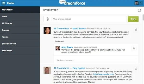
Phase 3: Event social network Salesforce (Chatter)
The Users and Their Environment
The Users:
New and returning Dreamforce attendees
Their Environment:
Online at salesforce.com/dreamforce
in the Dreamforce mobile app
at their hotel
at the Dreamforce event
My Contributions
Build a Platform for the Ages
Discover Issues
I identified requirements and opportunities by attending stakeholder meetings
I interviewed attendees from 2011 to learn their pain points
Define Challenges
I synthesized what I learned from stakeholders and users to clearly define their challenges
I translated requirements from stakeholder meetings into tangible features to be designed
Develop Answers
I collaboratively gathered input across departments and with attendees
I mapped user journeys, user task analysis, and interaction diagrams which informed our understanding of users
I conducted user research with attendee participants
I presented my observations and recommendations to key stakeholders
Deliver Solutions
I delivered solutions for unique challenges by leveraging Salesforce and UX best practices
I created and iterated task flows, wireframes, interfaces, mockups, and clickable prototypes for desktop, tablet, and mobile
My Methods
A Glimpse of the Process
I accomplished my goals by collaborating with Salesforce employees and previous attendees using the following methods.
Discover Issues by researching users, their current experience, pain points, and workarounds
Define Challenges and identify opportunities for improvement
Develop Answers to those challenges by collaboratively seeking input across departments and from past attendees
Deliver Solutions that leverage UX best practices and Salesforce Chatter
Discover Issues
Separate event registration and hotel reservation experiences
Once Dreamforce registration opens, all (I mean ALL) the hotels in San Francisco get booked fast.
On the first day available, attendees would:
Register for Dreamforce
Secure their hotel room as close to the event as possible
Submit their expense reports for approval
Otherwise, their options are staying farther from the event, and eventually outside of San Francisco altogether.
For reference, the ride sharing industry was in its infancy. Uber had only been around for a year or two. Lyft only became a thing in June of 2012.
So, to successfully reserve their Dreamforce tickets and hotel, attendees must
Purchase their event ticket, travel, and hotel from separate websites
Reserve a hotel close to the event
Act fast
Purchase everything early, so they can submit expense reports for approval
My Assumptions
Assumption 1
I assumed there would be a mix of repeat and first-time attendees.
Reasoning
Since the number of Dreamforce attendees nearly doubles each year, around half must be new attendees. This meant every year, about half of the attendees have never used the website. This is why the First-Time User Experience (FTUE) for registration had to be super simple.
Result
I was so right!


Assumption 2
I assumed my savvy marketing colleagues and stakeholders were familiar with Luke Wroblewski’s guidelines for web form design.
I assumed they would instantly agree that the account creation screen should be split into multiple screens.
I assumed they would agree that the first screen should have the absolute minimum number of required fields in order to create the account.
Reasoning
In 2012, most UX designers were familiar with Luke Wroblewski’s famous book, Web Form Design May 2008 (Rosenfeld Media).
Drawing from original research and his considerable experience at Yahoo! and eBay, Luke became known in design circles for his perspective on designing effective and engaging web forms.
Result
I was so wrong!
“Forms make or break the most crucial online interactions:
- Checkout (commerce)
- Registration (community)
- Data input (participation and sharing)
- Any task requiring information entry”
A Swing, and a Miss!
So, given my assumptions about Luke W’s form design, I was naturally excited to share Luke’s best practices with the executives during my initial proposal. I was confident Luke W’s information would help seal the deal for my design proposal.
While I was in the middle of presenting my proposal, it was vetoed.
I never even got to present Luke’s best practices. Since I was a contractor, I didn’t want to create any waves that might jeopardize my conversion to a Full Time Employee. Even if I had been more aggressive to defend my design decision, I’m not sure the outcome would have been any different.
“We’re going to display the 23 required fields on the sign up page.”
The executive ASSURED me that “Attendees can't wait to sign up. It doesn’t matter how many fields we throw at them, they’re going to sign up!”
So... I designed a signup screen. With 22 required fields on it.
Stakeholder Quote
“It won’t matter how many fields we throw at them, they’re going to sign up!”
Zoomed in view of registration (and 23 fields)

The Research
With a full set of wireframes, we wanted to ensure that user research had been conducted on the designs before Engineering implemented them. So, we partnered with a user researcher and tested wireframes with 20 past attendees. Most of the participants mentioned how long the form was to fill out, but filled out the form and proceeded anyway.
We brought our research findings and recommendations to the same executive. They reiterated that people were going to sign up in a frenzy, no matter how many fields we present to them. They told us not to worry about the number of fields on the signup screen.
Pro-tip
The most expensive way to do user research, is to develop the product and test it live on your customers.
The second most expensive way to do user research is to completely ignore user feedback.
Problems from 2011:
Separate event and hotel reservation experiences, no on-site experience
No session calendar or way to select sessions
No on-site experience for attendees
Define Challenges
The Challenge: Creating a single platform
Key areas that past attendees either lacked or had fragmented experiences:
Account creation
Salesforce user integration
Conference pass selection
Purchasing training
Purchasing certification testing
Reserving a hotel room
Researching sessions
Creating a custom event calendar for each attendee
Develop Answers
Phase 1: Registration
We started to build out the platform by focusing on attendee registration. The attendee registration journey includes:
Account creation
Conference pass selection
Training and certification selection
Hotel accommodation search and reservation
Payment
Phase 2: Event Sessions and Calendar
With registration released to the public, we started working on a session picker and attendee calendar for the on-site experience. Features include:
Session browsing by day, topic or speaker
Session details
Attendee Calendar
Phase 3: Mobile app for on-site experience
Finally, we wanted to provide attendees with a way to browse sessions and see calendar events like Keynotes, fundraisers, and the concert.
Tablet
iPhone
Deliver Solutions
Dreamforce 2012 Website - Login

Dreamforce 2012 Website - Sign up
Dreamforce 2012 for iPad


Dreamforce 2012 for iOS


What Did I Learn?
The Outcomes
Dreamforce 2012 brought amazing outcomes, like a record 77,000 attendees. And while I didn’t get all my design proposals adopted by leadership, I could try again in 2013.
What Did I Learn?
I learned a lot from designing for the Salesforce Events Platform for Dreamforce in 2012 and 2013.
Executive decisions can go against best UX practices
Data drives change
Present data to support my design decisions whenever possible
When presenting, lead with best practice, then the proposal
The proposal is the punchline, not the setup
Patience does pay off, but also speak up
Build rapport quickly. Rapport might have made the difference in the number of fields in 2012’s sign up screen
What Would I do Differently?
What I Would do Differently?
I would have started by speaking to Luke W’s web form design book, and then defended my proposal to have a fewer required fields on the account creation screen. I would have stood up for basic usability principles like having a sign up form with no more than 9 required fields on it. I would have told the executives that they might potentially spend large amounts of money on customer service costs because users would have difficulties filling out 26 required fields before the page times out in 15 minutes.
I might have done this the first time if I was a full-time employee instead being in a contract-to-perm situation. Who knows. I’m just glad I was converted to full-time, and was around long enough to see my proposal achieve its intended goal. To reduce the time it takes to create a user account, and reduce the time it takes to register for Dreamforce. It was a nice outcome that Salesforce saved over $100k the following year due to these changes in the account creation screen.