Case Study: Saving Salesforce $100k by Optimizing the Events Platform
Lead UX Designer
Results
Saved over $100k in Operational Costs: By optimizing key user flows
Timeless Design: Optimizations still in use 12 years later in 2025

Methodologies
User experience strategy
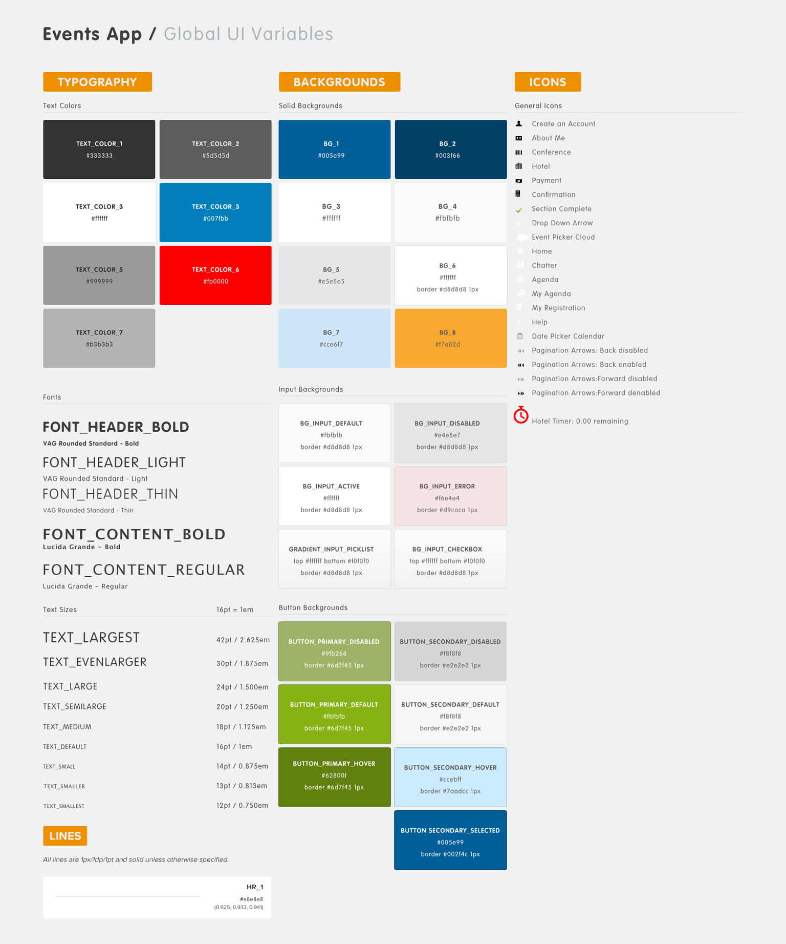
Design system creation
UX and UI documentation
Information architecture
Site maps, wireframes, and wire flows
Remote moderated usability research
Customer feedback
Concept validation
User acceptance testing
Solution sketching, Hi-fi mockups
Icon creation
Print design and production
Agile development
HTML and CSS definitions
Software
Adobe Photoshop
Adobe Illustrator
Balsamiq
The Project
What is Dreamforce?
Started in 2003, Dreamforce is Salesforce’s annual event. Dreamforce brings together the global Salesforce community for learning, fun, community building, and philanthropy. Attendees from all over the world gather to share their insights, successes, and learn the latest in industry innovations.
The Client: Salesforce
Salesforce is a company that provides Software as a Service (SaaS) apps for customer relationship management (CRM)
Dreamforce is Salesforce’s annual event for attendees, users, speakers, and sponsors for learning, fun, community building, and philanthropy
The Project: Optimize 2012
Modernize the look and feel by aligning to the new 2013 style guide
Improve the sign up/account creation process (for backstory, see 2012 Events Platform Case Study)
Optimize Functional performance
Enhance flow and interactions
Modernize user interface and standards
Reduce operational costs
My Role: Lead UX Designer
Timeline:
October, 2012 to November, 2013
Focus:
All stages, discovery through design
Features:
Phase 1: Align to rebrand redesign
Phase 2: Optimize problem areas
The Users and Their Environment
The Users:
New and returning Dreamforce attendees
Their Environment:
Online at salesforce.com/dreamforce
in the Dreamforce mobile app
at their hotel
at the Dreamforce event
My Involvement
Solo UX designer on the elite team of internally-recruited developers, quality assurance engineers, a product owner, and a scrum master
Now a full-time employee, I charged ahead with confidence and the support of my UX Department
back to top
My Methods
A Glimpse of the Process
I accomplished my goals by collaborating with Salesforce employees and previous attendees using the following methods.
Discover Issues by researching users, their current experience, pain points, and workarounds
Define Challenges and identify opportunities for improvement
Develop Answers to those challenges by collaboratively seeking input across departments and from past attendees
Deliver Solutions that leverage UX best practices and Salesforce Chatter
back to top
My Contributions
Optimize and Improve the Platform!
Discover Issues
I identified pain points and opportunities from the 2012 events app by conducting attendee and stakeholder interviews
New challenges emerged from Dreamforce 2012 that could be addressed through design improvements
Define Challenges
Challenges identified in 2012 were still present after the conclusion of Dreamforce 2012
Insights regarding operational cost from Dreamforce 2012 informed new challenges for 2013
I translated customer interview findings into tangible challenges
I synthesized our learnings from stakeholders and users to clearly define the challenges to be addressed in 2013
Develop Answers
I collaboratively gathered input across departments and with attendees
I mapped user journeys, user task analysis, and interaction diagrams which informed our understanding of users
Deliver Solutions
I swiftly delivered solutions for unique challenges by leveraging Salesforce and UX best practices
I created and iterated on task flows, wireframes, interfaces, screens, and clickable prototypes for desktop and mobile
I presented solutions that addressed the challenges defined from 2012 by simplifying the sign up process
back to top
Discover Issues
Design Debt or Executive Decision?
The Answer is Both!
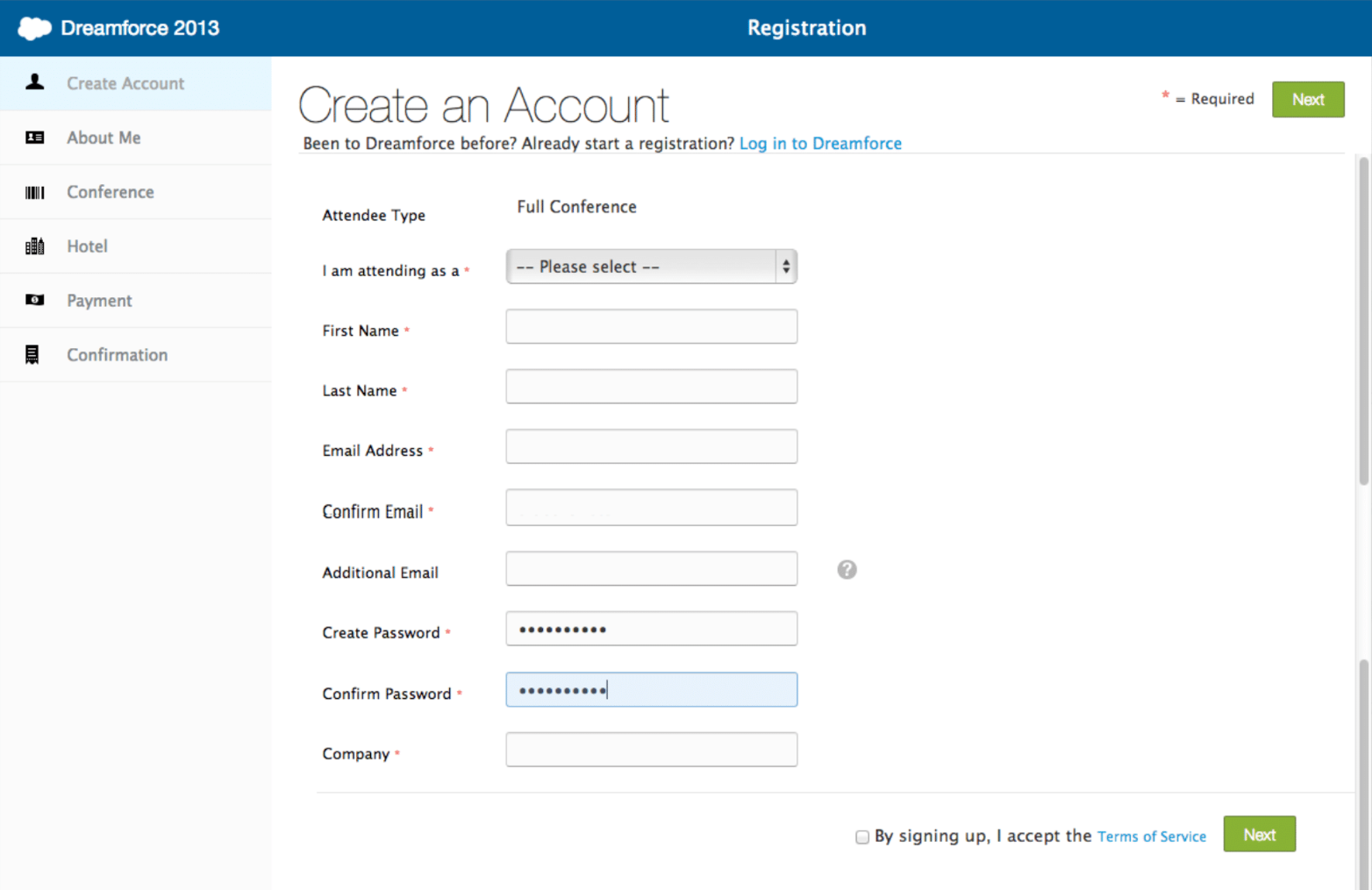
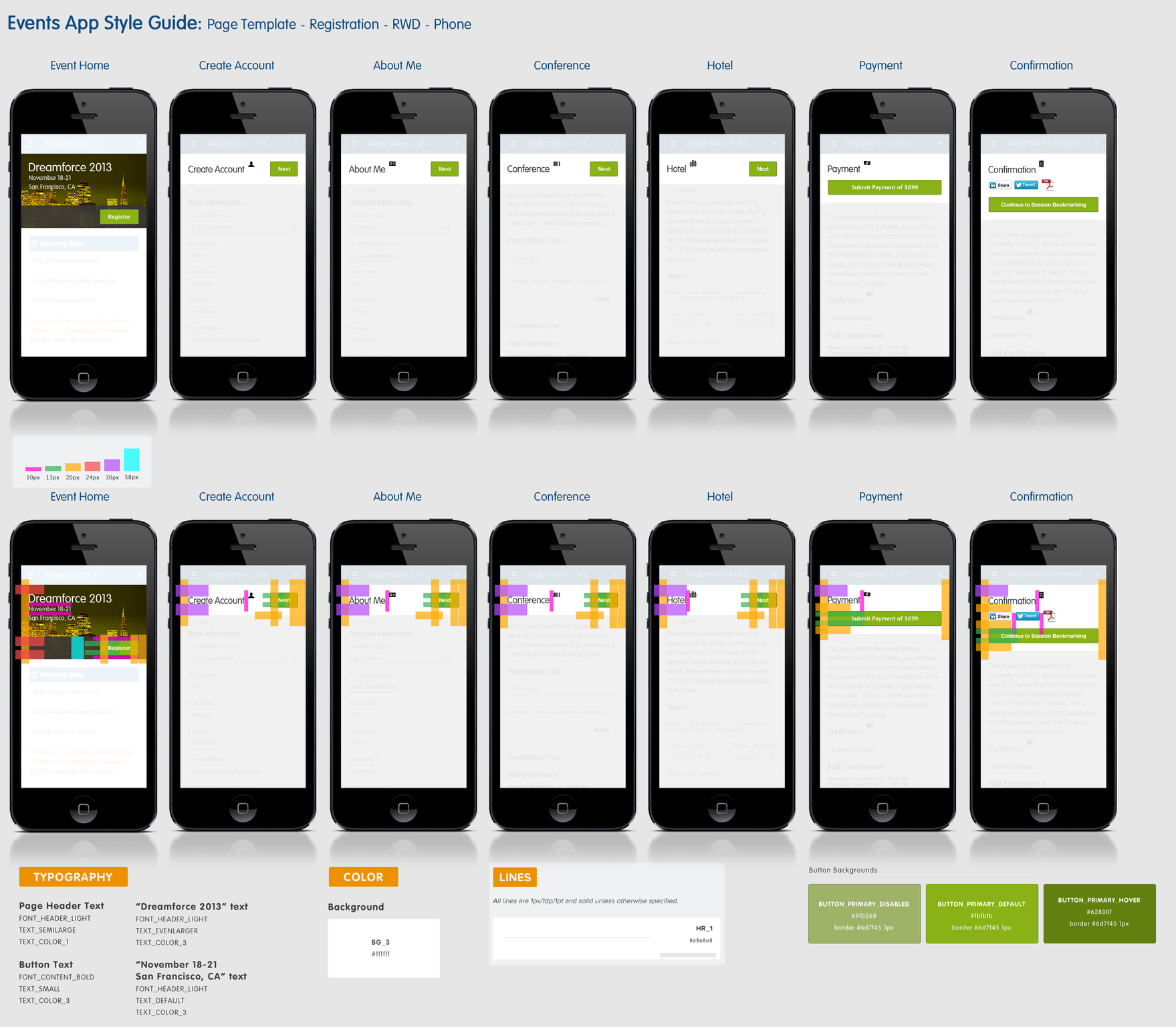
The #1 issue for 2013, was the 2012 sign up screen. In 2012, I was concerned about users completing signup if the screen had 23 required fields. I proposed a shorter signup screen with about 6-8 required fields. Even after user research findings supported my design and concerns, we plotted a course to build a sign up screen with 23 required fields. The signup screen was the first screen attendees encountered during the registration process (example shown).
Turns out, lots of customer service calls to our expensive call center only further highlighted my concerns. Unfortunately, this was after the registration process had launched. At that point, the project was focused on building new features. We didn’t have the luxury to go back and revise the sign up screen.
Those customer service calls might have been avoided if we had implemented a shorter sign up screen in 2012.
Hindsight, amirite?

The Snowball Effect
Wait, didn’t he use this chart in that other case study?
Why yes, thanks for noticing. This time around, I’m using it to illustrate that customer service calls might also double for 2013 if no changes are made to that first registration screen.
That could mean the cost of the customer service center would at least double.

2012 Data Drives Change
Turns out, when users are required to fill out 23 fields on the first screen, it can create a real challenge to complete. Couple that with a page that resets after 15 minutes of inactivity, and we end up with a lot of frustrated users.
2012: Inefficient App Experience
23 required signup fields caused confusion, and slowed down account creation
Attendees lost their progress when the system times out after 15 minutes
Frustrated attendees call customer service to finish registration
back to top
Define Challenges
Design Debt
The Look and Feel
Design trends change often; The website and application were ripe for a refresh the day after Dreamforce 2012 ended
Simplification was a major UX and UI theme in 2013, more so so than in previous years
Customer Frustrations
Frustration 1: Sign up
Completing the first screen of sign up was one of the biggest challenges for Dreamforce 2012 attendees
The 23 required fields made sign up a lengthy, daunting step
Frustration 2: The page resets
After 15 minutes of inactivity, the page resets, and all progress is lost
back to top
Develop Answers
My Assumptions
Assumption 1
I assumed we would eventually use my design for the account creation screen.
Reasoning
Based on our user research findings from Dreamforce 2012, I had every reason to believe my proposed design would eventually see the light of day. Little did I know that data from Dreamforce 2012 would back up my theory. More on that in a moment.
Results
I was so right!
Deliver Solutions
Before and After
2012 sign up
2013 sign up
Pro-tip:
Doing fun photoshoots for might just get you the new style guide before anyone else.
Rapport. It’s a game changer!

back to top
What Did I Learn?
The Outcomes
Dreamforce 2013 brought amazing outcomes, building on 2012's successes. Knowing the bar was raised, I identified key areas for improvement. We introduced an elegant new design system for 2013. The signup page, for instance, showed the most potential. With attendee numbers doubling yearly, I was unsure if our improvements would materialize. We reduced the signup fields from 23 to 8, significantly cutting account creation time. However, with 77,000 additional attendees, I was still concerned about performance issues affecting the signup and other screens.
143,000 attendees, shattering and almost doubling 2012’s record of 77,000 attendees.
Support calls were reduced by more than 50%
Call center costs also dropped by more than 50%
Call center cost savings of almost $100,000!
The simplified account creation concept from in 2013, is still in use in 2024!
What Did I Learn?
I learned a lot from designing for Dreamforce 2012 and 2013.
Data drives change
When presenting, lead with best practice, then the proposal
The proposal is the punchline, not the setup
Patience does pay off, but also speak up
When I feel strongly about a design, I need to be more vocal
I had a good rapport with those executives, but not when I initially made my proposal
During my first presentation to Salesforce executives, I was less comfortable
Now, I confidently discuss design decisions and proposals, supported by user research, measurable costs, and my decades of experience
back to top
What Would I do Differently?
What I Would do Differently?
I would have started by speaking to Luke W’s web form design book first, and then propose a design to have a fewer required fields on the account creation screen.
I would have stood up for basic usability principles like having a sign up form with no more than 9 required fields on it.
I would have told the executives that they might potentially spend large amounts of money on customer service costs because users would have difficulties filling out 23 required fields before the page resets after 15 minutes of inactivity.
I might have done this the first time if I was a full-time employee instead being in a contract-to-perm situation. Who knows. I’m just glad I was converted to full-time, and was around long enough to see my proposal achieve its intended goal. To reduce the time it takes to create a user account, and reduce the time it takes to register for Dreamforce. It was a nice outcome that Salesforce saved over $100k the following year due to these changes in the account creation screen.
back to top