Case Study: Increasing Access to the Verizon Partner Program
Lead UX Designer
Results
150% increase in Registration Access: by redesigning partner program website architecture
Find it Faster: Streamlined layout and content allows users to more easily find what they’re looking for
Measurable Metrics at Your Fingertips: Saved managers 40+ hours/month by designing partner program analytics dashboards
Methodologies
User experience strategy
Information architecture
Site maps
User journey mapping
Concept validation
User acceptance testing
Solution sketching
High-fidelity mockups
Wireframes
Wire flows
Remote user research
Customer feedback
The Project
The Project
Simplify the Verizon Partner Program website and make the registration process easier.
The Client: Verizon Business
Verizon Business is a division of Verizon Communications, that provides services and products for Verizon's business and government clients
My Role: Lead UX Designer
Timeline: November, 2023 to April, 2024
Focus: Discovery, Design
Features:
Partner program website redesign
Sales Agent tool
Sales manager reporting tool
The Users and Their Environment
User: Prospective partners
Setting: verizon.com/business/resources/partner-network
My Methods
I accomplished these goals by collaborating across departments with Verizon Business employees using the following methods.
Discover Issues by researching users and their current experience, pain points, and workarounds
Define Challenges and identify opportunities for improvement
Develop Answers to those challenges by collaboratively seeking input across departments
Deliver Solutions that leverage Salesforce Lightning Design System, Lightning Web Components, and out-of-the-box solutions
Discover Issues
Improve the Registration Numbers!
Discover Issues
I start every project by evaluating the information architecture, user flows, and interfaces using some of Jakob Nielsen’s 10 usability heuristics. At the same time, I’m learning the ins and outs of the product, which will help me when I conduct user research. Once the product is evaluated, I can easily improve it.
The site needed improvement after I identified issues regarding:
Consistency and Standards: Inconsistent display of Call To Action buttons
User Control and Freedom: Registration screens are buried three to four pages down, making registration a challenge
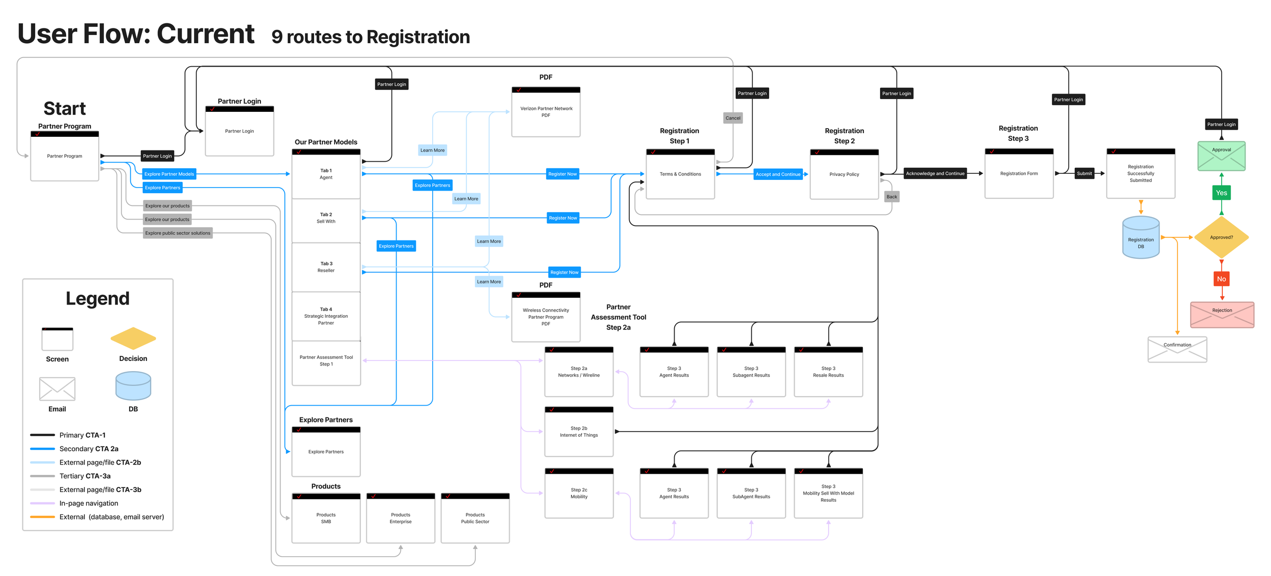
Recognition Rather Than Recall: The 9 pathways to registration are only on certain screens, requiring the user to recall where to register
Consistency and Standards: The screen layouts were different depending on the partner type or program, creating confusion
I then conducted a competitive analysis to ensure best practices were being used on the Verizon Partner Program.
Once I had a solid understanding of the competitors, I compared the heuristic analysis findings to the competitor’s sites.
I also mapped the user flow, including all CTA buttons, links, and processes.
Current User Flow: 9 paths to registration
Now, I had all the information I needed in order to make an plan of improvement for the Verizon Partner Program website.
Define Challenges
It Takes Too Long to Find the Registration Screens!
Challenges identified include:
“Register” Call to Action button was on only a few screens, 3-4 pages deep, and placed inconsistently on the page
Screens had clutter and inconsistent layout
Content was lengthy
In other words, there was plenty of work to do.
Develop Answers
Different Partner Types Have Different Support Systems
Depending on the partner type, Verizon supports partners in various ways. Each partner type has a corresponding support team at Verizon, with very different goals. The nuances of each partner type were somewhat buried in walls of text on partner type pages.
I collaborated with partner team leaders to provide concise information for prospects on the partner program website.
This led to:
Standardized screen layouts so information flows consistently regardless of the page
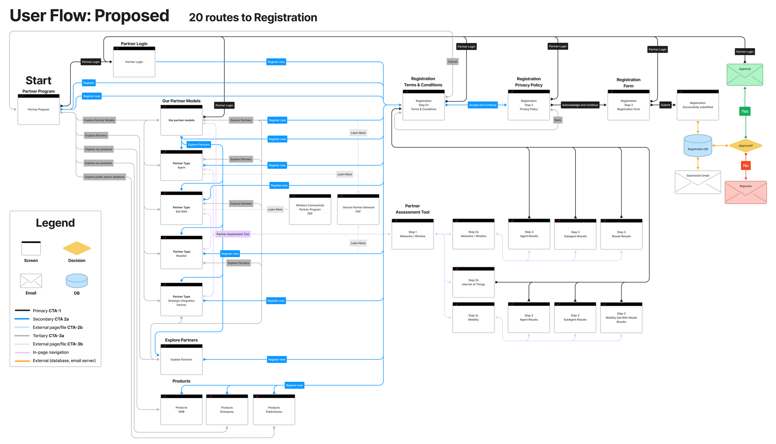
A consistently displayed “Register” button on all screens for easy access
Deliver Solutions
Simplify, Simplify, Simplify!
My design process for this project involved many explorations and iterations of the website. My goal was to reduce the amount of copy and vertical height of the screen, without compromising on presenting the required information for users to make an informed decision about registering for the Partner Program.
I surfaced information about the different partner models to the home page, allowing users to more easily see the program options. Additionally, I modernized the Partner Assessment tool by providing buttons with clear Calls to Action for users to choose from. I reduced the overall height of the screen, allowing users to not be overloaded by information.
I was able to swiftly deliver these solutions by leveraging the Verizon design system.
New User Flow: 20 Paths to Registration
Partner Login: Before and After
Partner Network and Partner Models
What Did I Learn?
Instincts first, process later.
I knew my revisions would simplify the experience and provide more pathways to registration, even if I wasn’t able to conduct user research. I’m a firm believer that “Design is just a theory until user research is conducted.” In this world of data-driven design decisions, my design decisions are driven by data collected from my 16+ years of successfully creating compelling solutions for companies. My design instincts propel projects in the right direction, and provide a boost to ambitious goals and tight timelines.
What Would I Do Differently?
Sometimes steps in the design process are skipped, and that’s okay.
Even though I improved the paths to registration by consistently displaying the Call To Action buttons on all pages and streamlining the information architecture, There are things I would have done differently.
I would have interviewed users throughout the project to ensure the alignment with user needs. The design process is imperfect, and often incomplete. Time constraints, access to users, budget, resources are some of the aspects that shape the design process for a project. And yet, as designers, we are able to create experiences that drive transformation, revenue, and any other goals that are put in front of us.


